
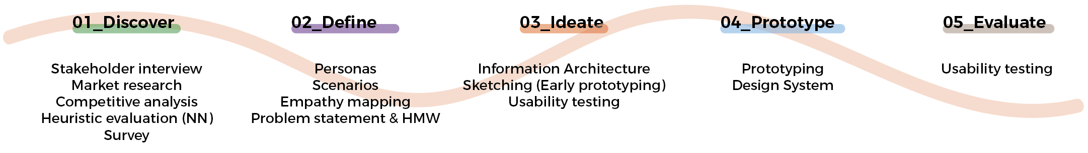

Heuristic analysis
I decided to perform an heuristic analysis, based on Nielsen’s principles, before submitting a survey to their user base.
This was done previously to have a technical vision of the product and also to better understand the cues that surely would have been emerged from the survey. Of course this helped me at the same time to learn the platform and products in a deeeper way, without getting any kind of bias from users.
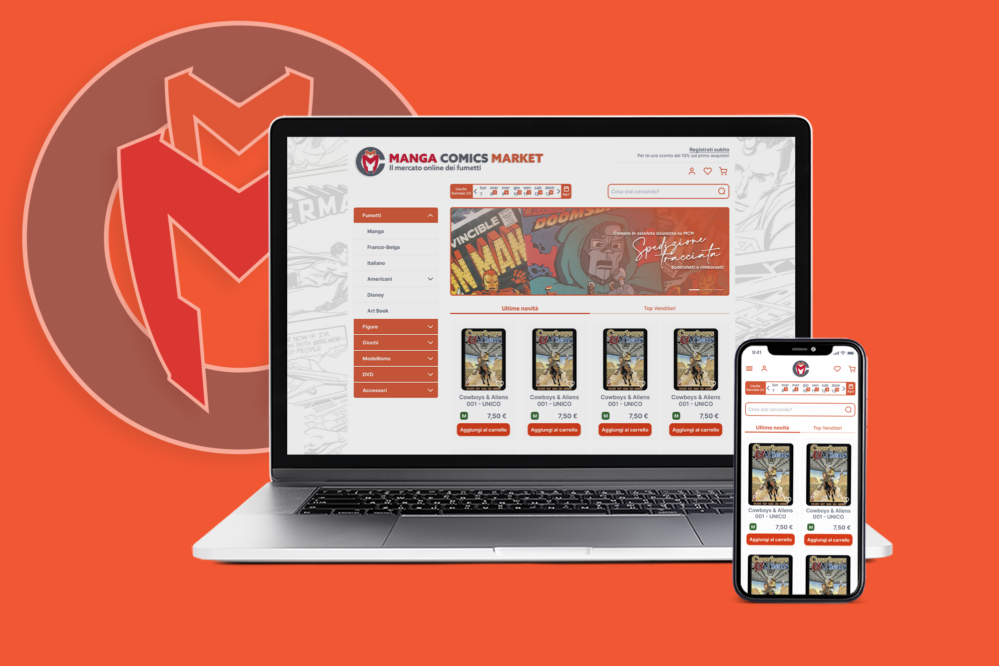
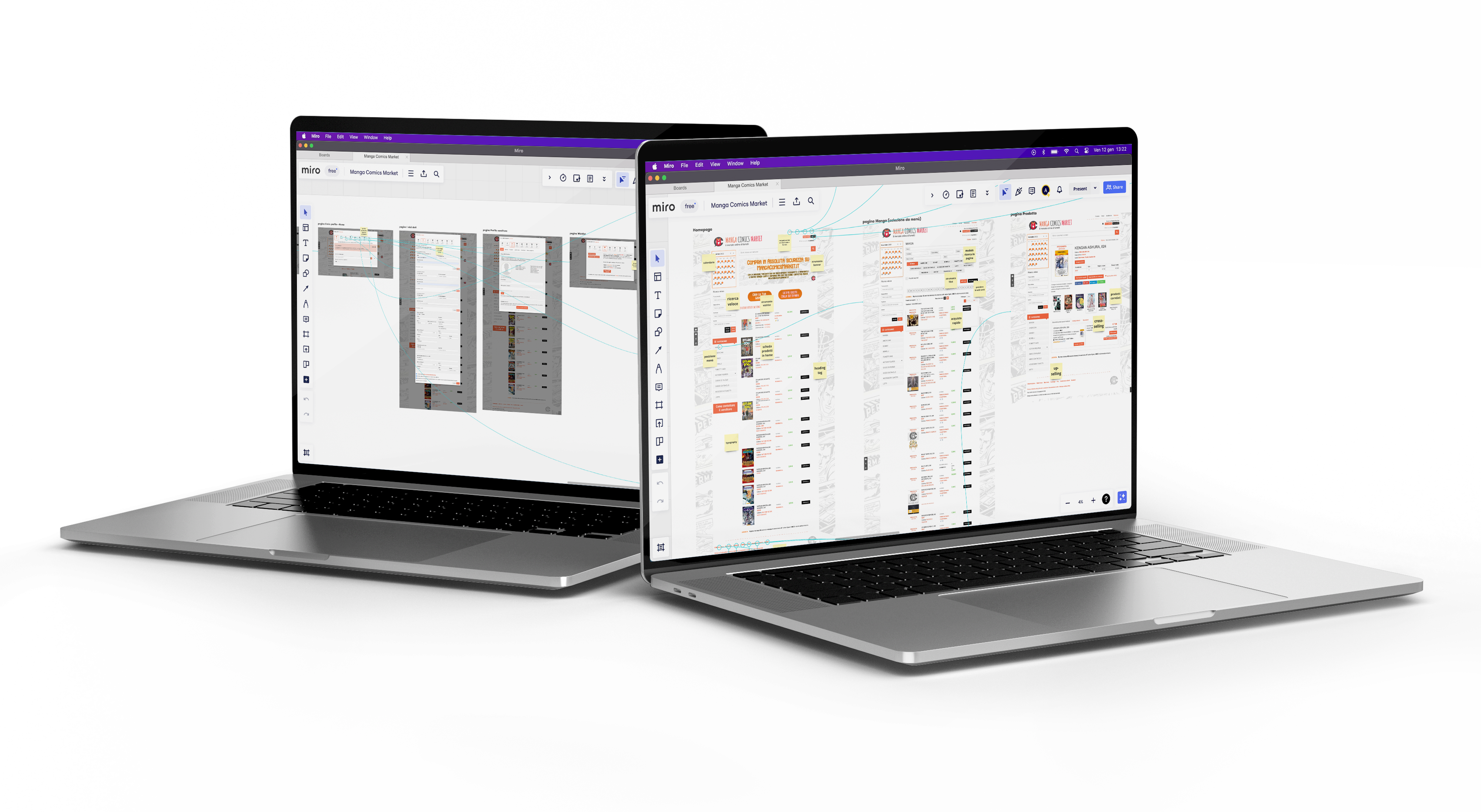
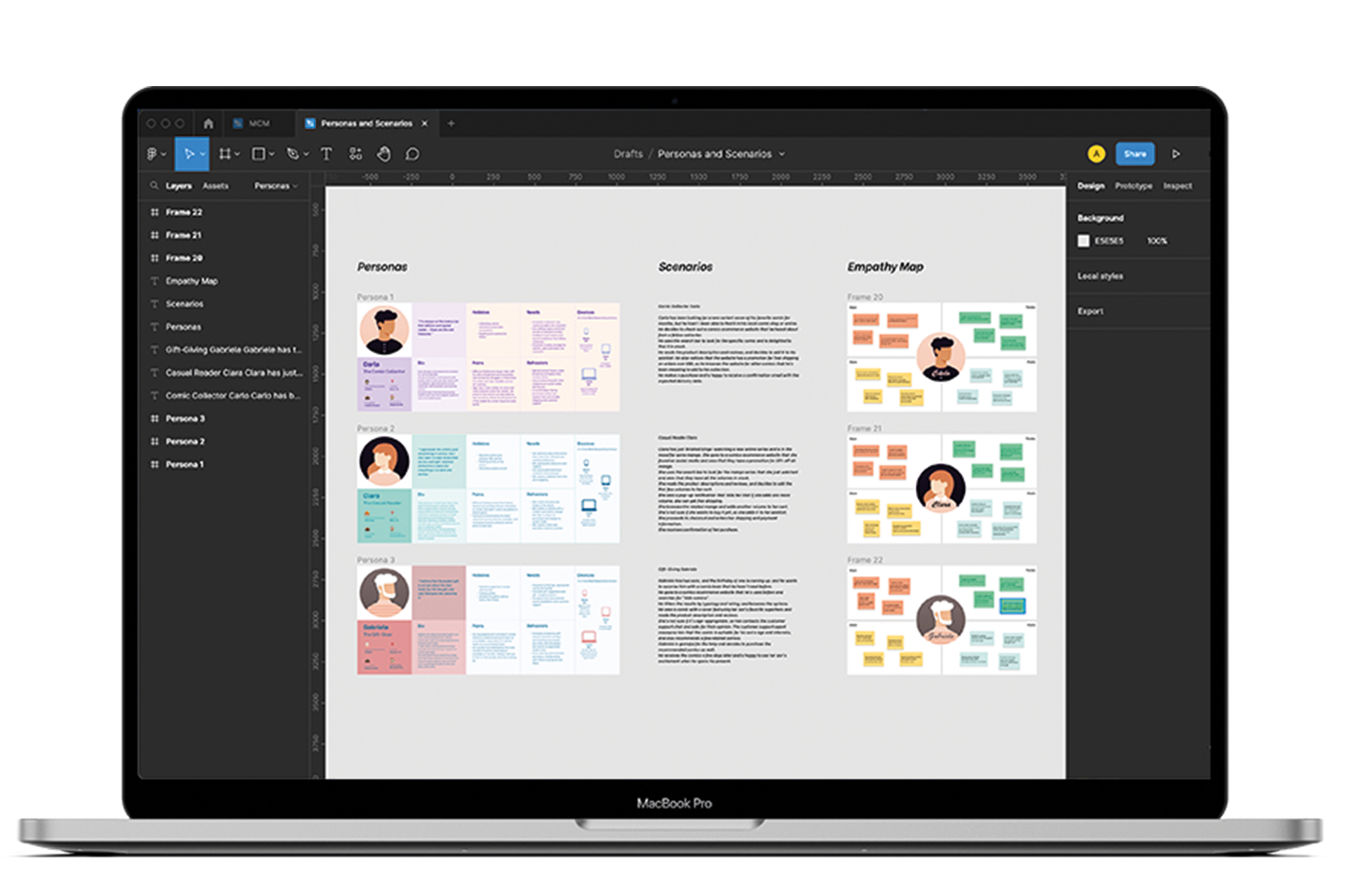
I took advantage of this step to also visual-map the AS-IS platform and flows.
Key findings

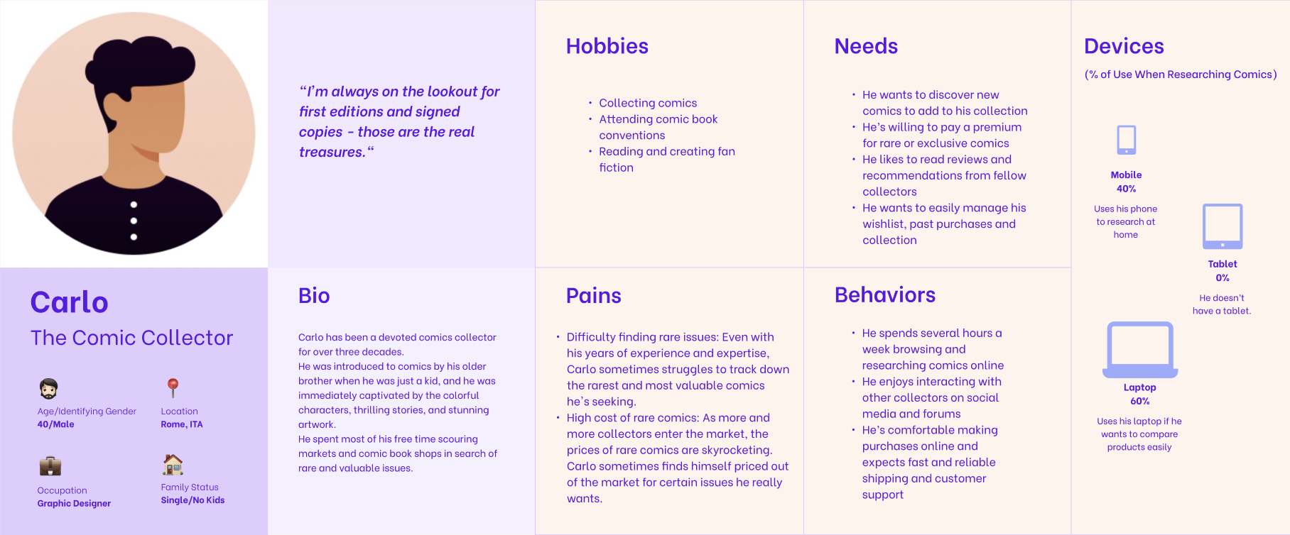
Personas
Once the information is collected through the survey, I helped my client to better understand needs and preferences of their target customers, and design products and services that meet their needs more effectively by creating Personas.
I decided to deepen the research by crafting three different Personas, and it delivered excellent results; users are passionate, generally skilled about the product and the market; they complain a poor experience and difficulties to move on the platform, which is an obvious evidence of a not enough structured IA.
Scenarios
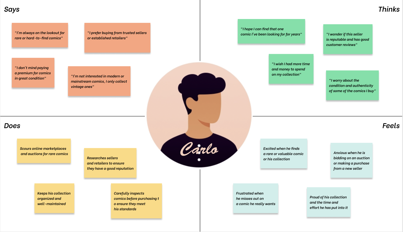
After getting Personas by combining different tools during the research phase, I put them in some Scenarios to assume how they could interact with the product.
Scenarios are useful to explore and understand user needs and behaviours, and to identify potential pain points, opportunities, and design solutions.
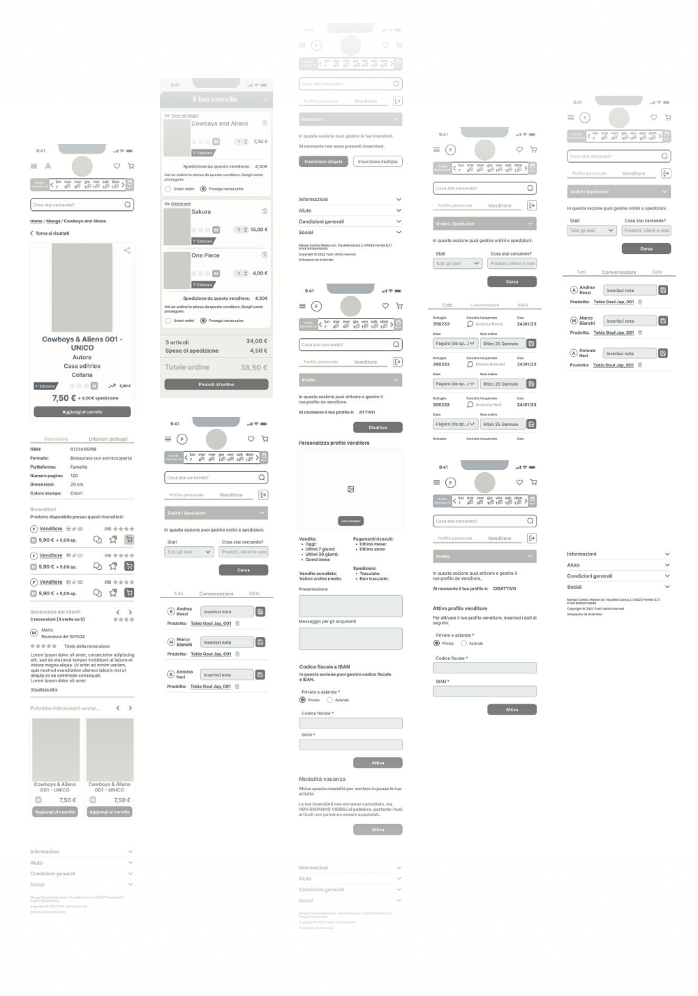
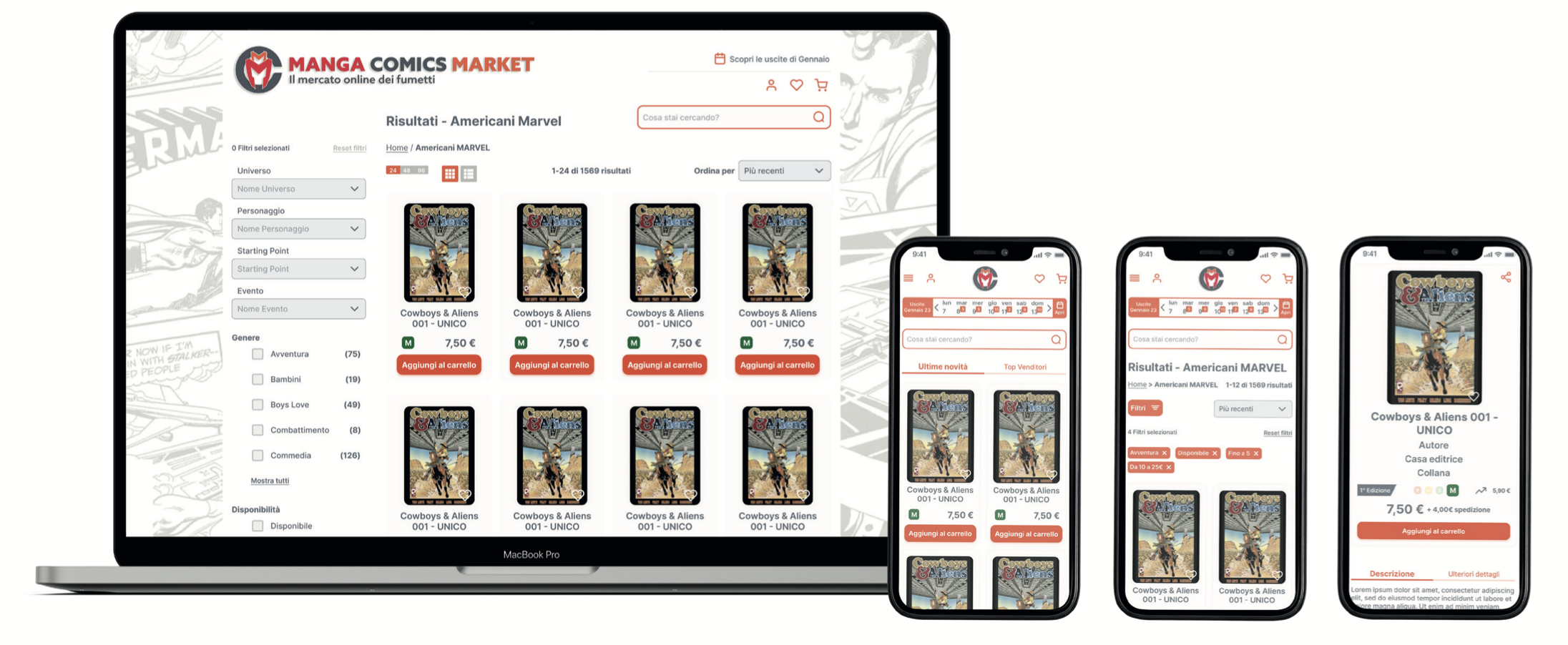
Prototyping
Once got some cues by testing our low-fi prorotypes, and after a short period of iterating solutions, I moved on, taking prototypes to the next level, so by creating hi-fi deliverables.
Figma prototypes have been designed with the highest possible accuracy, to ensure that experience and interaction could be as close as possible to the reality during the final stage of testing.
What comes next
The redesign of Manga Comics Market has been completed and shared with the working group in early May ‘23; the development team has estimated 10 months to carry out the project.
The futher two stages, not less important than the previous ones but outside the perimeter of design, will be:
-
Staging – The implementation will be evaluated, if it coherently respects the designs as created, and feedbacks will be provided.
-
Post-Launch – Analyzing data and monitoring the live product to identify future improvements and determine if the project goals have been achieved.